When you see something moving out of the corner of your eye, it instantly catches your attention. It could be a butterfly, your pet, or someone creeping up on you. No matter how much you don’t want to be distracted, whatever caused the movement now has your full attention.
Animation uses the same principle to great success. Using animation in its various forms makes information stand out from the crowd.
A distraction technique based on science
The science behind our reaction to moving images is incredibly interesting. Our minds perceive static and moving images in different ways. When the eye detects motion, we are immediately drawn to look at it. Even the subtlest of movements will grab your attention. Still images are interesting but we’re not instinctively drawn to them like we are to moving ones. People use this natural instinct to search out interesting content online.
Look at me! I’m a moving image
90% of information transmitted to the brain is visual. Bear this in mind if you’re looking for new ways to make your work stand out from the crowd. It can be difficult to communicate facts using only text and/or static images. Presenting data as moving visuals or animations makes for more engaging and memorable content. In fact, studies show when people hear information, they will recall only 10% of that information three days later. If a relevant image appears alongside the same information, people retain 65% of the information three days later.
Eye-tracking studies also prove internet users are drawn to information-carrying images. In fact, where relevant images are present, readers spend more time looking at these than they do reading any text on the page. According to BrightCove, brands that use video increase time spent on their website by 105%.
So how do you stand out from the crowds and make your online report attention grabbing?
There are lots of different ways animation can be used to help promote your content. Here are three of my favourites:
Animated infographics
Infographics are liked and shared on social media three times more than any other type of content (Mass Planner, 2015). They’re ideal for telling complex stories and depicting technical processes and procedures as simple visual steps. Moving elements can be added to draw the eye to a part of the graphic, perhaps to highlight powerful statistics and findings. Animating charts and graphs helps emphasise the differences between data. Used sensibly, subtle movement in an infographic will engage viewers and bring your data to life.
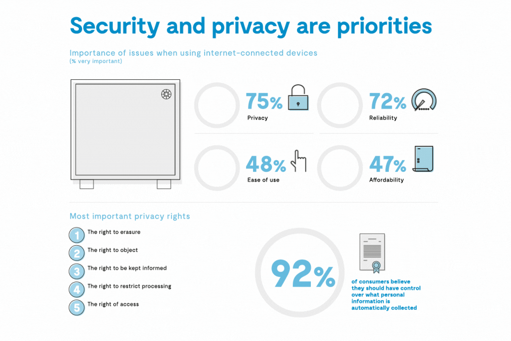
Zendesk’s animated infographic below uses small amounts of movement to add to the viewer experience. 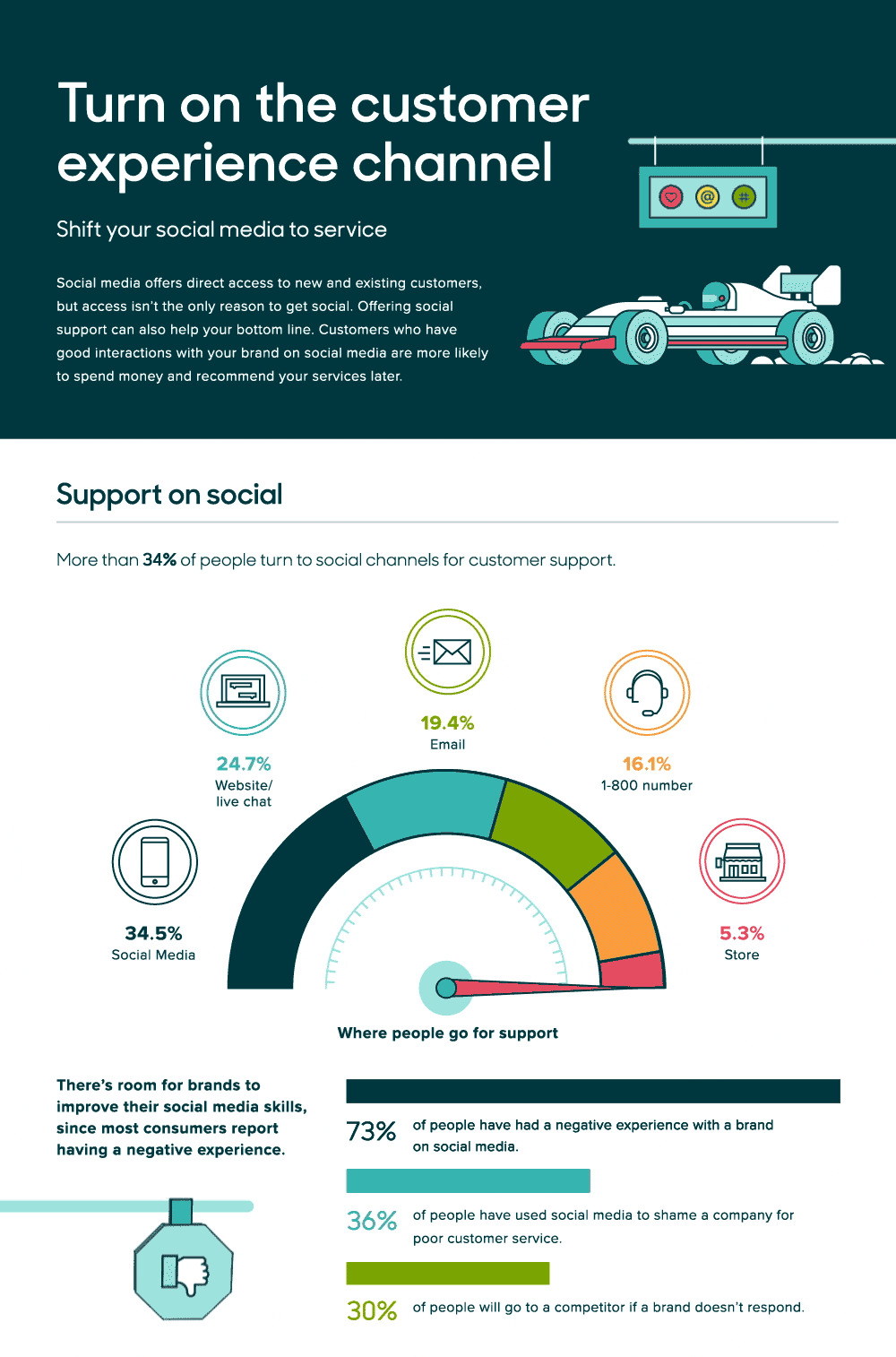
Animated social media graphics
Each day we spend an average of 135 minutes on social media (Statista, 2018), scanning our feeds for nuggets of interesting and engaging information. Promotion on social media is crucial to spreading awareness on platforms such as LinkedIn, Facebook and twitter.
Video in all its forms (including short animations) is highly consumable social media content. Facebook posts with videos have 135% greater organic reachthan photo posts, and 80% of people can recall a video ad they’ve viewed in the past 30 days.
The key to a successful and shareable social media graphic is to grab users’ attention as they scroll through their newsfeed. Animated content is an effective way to do this.

Animated data visualisation
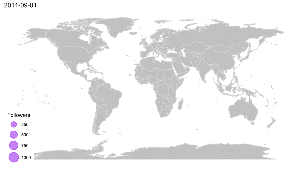
If you want to share complex data sets or processes, using moving rather that static graphics adds impact. Animation can be used to simplify data and tell stories. It’s particularly effective for depicting geographical information and maps in which movement needs to be shown, or to demonstrate trends and changes over a period of time. The human brain is designed to capture, retain and remember visuals much faster than words. By representing your information as moving images, you’re making it easier for your audience to digest.
Make your animated content accessible
With video content now accessible on the move on tablets and mobile devices, organisations can extend the reach of their reports using animated graphics. However you choose to present your content, always ensure it’s accessible – to different devices and to all users. Flashing or flickering graphics might not be suitable for photosensitive or visually impaired users. Ensure your animations stand out from the crowd for all the right reasons.
Animated graphics can be used to great effect to promote your research and reports in a variety of ways. Contact us today to discuss the types of animation that could work well for your project.