
3 powerful ways to improve your organisation’s presentation design
Presentations can be a compelling way to showcase your knowledge, experience and specialisms. Delivering a successful presentation is not just about how you speak, it’s
Presentations can be a compelling way to showcase your knowledge, experience and specialisms. Delivering a successful presentation is not just about how you speak, it’s

Last week I had the pleasure of interviewing fellow designer Peter Lippitt of Peter Scarks Design about his journey into infographic design, how he creates
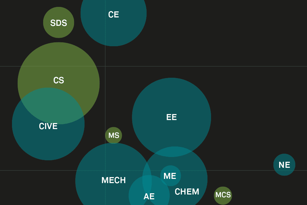
A little something I’ve been working on whilst waiting for some content through for client projects. I wanted to play around with showing 3 data

I’m often asked “So, what is it that you actually do?!” Well, here is a typical working day for me… My first act of the

Slide:ology is a reference book covering much more than just presentations. It details visual storytelling development for the layperson as well as the designer. Containing

I never understood why I like things to be neat, tidy and – most importantly – to work. As a perfectionist I’m always looking

Some clients find it very hard to imagine the design you’ll create. Often they aren’t able to visualize a project and feel nervous about