
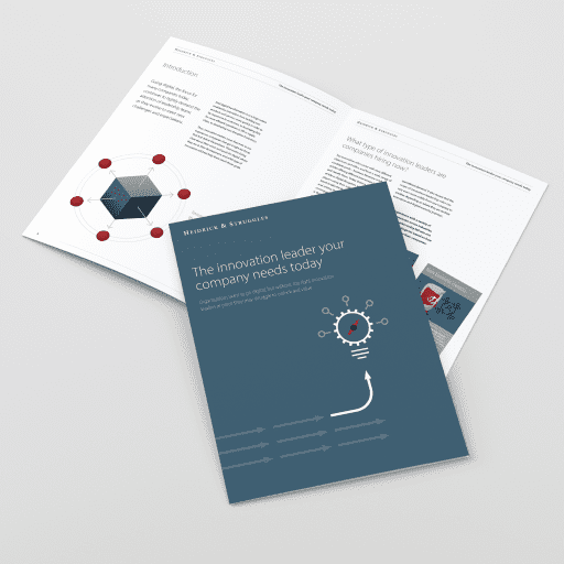
The ability to produce a professional report design is not a dark art. By adopting some simple guidelines, you can create documents that your audience will be able to read and understand more easily.
The report designs we create for our clients are based on the science of how our brain and eyes work when they engage with information – these guidelines use that same science.
It’s all about cognitive fluency; the ease with which we process information in the form of words or graphics so that we understand their meaning. It’s our job to make that process as short and simple as possible.
We’re sharing six creative guidelines that we use to do this within our work, and that could help give professional finesse to your own report design.
01. Add a page header
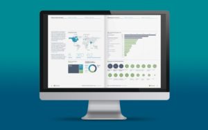
Including a page header in your report design is a simple but effective feature. Many reports are now viewed digitally, and navigation bars can help your readers to move around your content more easily. They also give structure to the page and the document as a whole, framing the content and providing a consistent reference point for readers. Use colour or a bold font to help readers see where they are in the report.
02. Use columns for body copy
The column structure in which the words of the report are set is a key design feature of any written document and the width of a column affects readability.
We don’t read character by character or even word by word but instead we scan and then pause to pick up groups of three or four words. As three or four pauses happen before it gets tiring, we can work out that a column width should be between 9-12 words. That’s the principle.
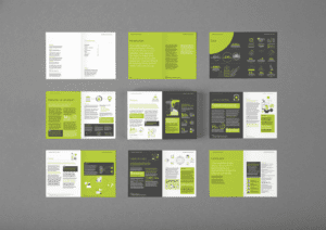
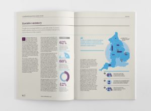
Using two or three columns for your text can completely reinvent the look of your report. Try using one column for pull-out quotes, key points or imagery. It’s worth noting that white space is not wasteful, but more of that later.
03. Experiment with fonts
Before you start, think about the style of font (or typeface) you would like to use. Bear in mind that your choice will have an impact on how your report is perceived by readers as well as the more pragmatic design consideration of how easy it is for them to read it.
Try and break out of the default standard fonts, Times New Roman and Arial for example. There are plenty of good, standard fonts to choose from, whether you’re using Mac or Windows. Google fonts also has plenty of free commercial typefaces to download and use.
Fonts that have a range of weights (light, regular, medium, bold, italicised) are especially useful as you can add more sophistication to your report design. Light weights are effective for body copy and medium and bold for headings.
Add colour for important information such as headings and call-outs. Try a dark grey for body copy — it’s less stark than black and can make a report feel warmer and more appealing. Don’t go too far and too bright with the colours — readers will be put off as they reach for sunglasses and headache tablets.
04. Reduce the font size
In general, 10pt or 11pt is the widely used default size but in professional report design we most often use 9pt, sometimes dropping to 8pt. Often, text in 8pt or 9pt with deeper line spacing (known as leading) can be easier and faster to read because our eye can more easily see where the next word or line starts.
Consider if it’s likely that the report you’re working on may be read by those, old or young, who are partially sighted. Guidance about point size can be found on the websites of the RNIB, the charity for blind and partially sighted people or the UK Association for Accessible Formats.
05. Use white space
White space does not have to be white — the term simply refers to the space around written content, and it is certainly not wasted space.
Using white space enables you to draw your readers eye to a particular point or paragraph that you want to highlight and then gives your readers the room so that they can focus on the key section; understanding rises accordingly.
White space also allows the eyes and brain to rest at points, to stay interested as layouts differ from page to page, and prevents the brain from tiring as quickly as it might when presented with a full page of information to process.
06. Think about alignment
Alignment of words is simply the way in which you arrange the lines on the page. The most common are justified and ranged left. The former is where the column of words is aligned on both the right and left of a column; the latter is where the text is aligned just on the left.
When text is justified, each line is the same length, so the spacing between words varies from line to line. Justified text can look neater in smaller point sizes and wide columns, but is harder to read as the start and of end each line is more difficult to find.
When text is ranged left, the spacing between words is the same throughout the document, and the staggered line lengths actually make it easier to read as our brains more easily identify where a line starts and ends.
Our advice is to use left-ranged text with a two or three column layout.
The way a report is designed can say a huge amount about the value you place on your content. Client and, more importantly, potential client perceptions will be informed by the design of printed or online reports you produce as well as by the way they read.
If you’d like to chat to us about how we could help you create a professional report design, call us on 01606 276176 or email us workwithus@nwc.design.