
As businesses become more and more data-driven, so it follows that the professional graph design, charts and visualisations that communicate this data are more important than ever.
Data is everywhere in our daily lives. We see it being presented in so many slick and attractive ways, on fitness trackers, weather apps, software dashboards, even TV sports commentaries.
This means it is essential that the data is shown correctly, that it’s engaging, and most importantly, that it’s useful.
For most of those in business, creating and presenting professional business graphs and information has become a must-have skill, but some are trapped in an ‘excel default’ world.
“Data is now rightly seen as an invaluable asset, something that can genuinely help change the world for the better or potentially create a competitive goldmine, depending on your perspective.”
– Andy Kirk, Data Visualization: a successful design process
The importance of professional-looking business graphs
You should visualise data in such a way that the people you’re showing it to can quickly understand the information it contains.
You can use this process to your advantage:
- You can persuade them to follow your line of thinking and inspire them to act in a way that you would like them to.
- They are more likely to engage with, and act on, information that they understand easily.
As well as being used to explain and inspire, well-designed data adds value to your business and brand. If people understand the information, they trust it, and that trust is transferred to your business.
By presenting data in a clear and engaging way, you can nurture that loyalty and trust, so it’s important to get it right.
“The stakes here may be higher than you suspect. Perceptual fluency research suggests that we make qualitative judgments about information on the basis of it’s presentation. If something is hard to perceive, people will not only struggle to find the right meaning, but judge it less favorably.”
– Scott Berinato. Good Charts. Harvard Business Review Press.
5 tips for creating professional business graphs
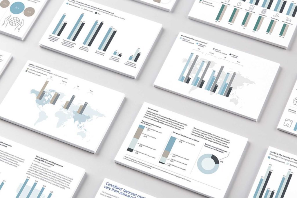
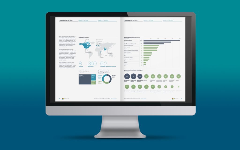
At NWC Design we use our skills and experience to produce professional business graphs that engage and inform a wide range of audiences. Here’s five tips for you on how we do it.
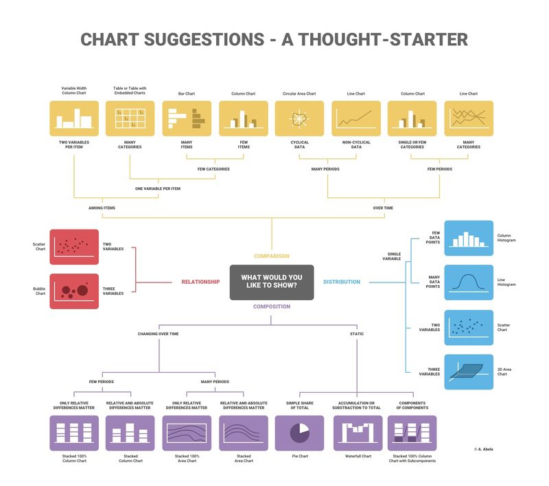
1 – Choose the right graph type
In order for your chart to be understood as easily and as quickly as possible, you must choose the most effective graph type to show it. There’s usually several ways to show a dataset and choosing the right one for your narrative is crucial. Rather than re-invent the wheel, we’ve used a visualisation by info.gram (full article available here) to help you do just that.
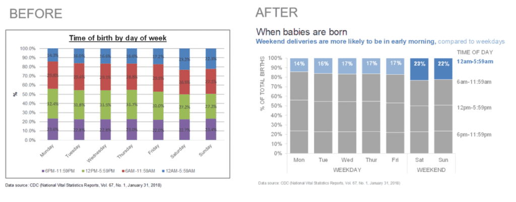
2 – Simplify
We’ve said it before but it’s so important we’ll say it again: remove anything from your chart that isn’t needed to tell your story:

3 – Amplify
To speed up comprehension and move to the ‘engaged’ part of your presentation, amplify your key points. You can persuade audiences to agree with your point of view by showing them where you’d like them to look and then telling them what you want them to take away.
“We see first what stands out. Our eyes go directly to change and difference, such as unique colours, steep curves, clusters, or outliers… Whatever stands out should match or support the idea being conveyed. If it doesn’t, it will distract from and fight for attention with the main idea.”
– Scott Berinato. Good Charts. Harvard Business Review Press.
Use colour to make the information you feel is most important within your professional graph design stand out. For example, you could use grey for all data points except one:
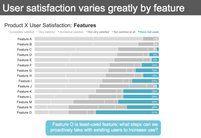
Another way use colour to highlight a key point is to annotate the chart. Add a coloured box or pull-out sentence summarising your argument. Your audience is likely to spot this first and so they’re already prepped to hear your point of view:
4 – Summarise
Make it clear what you want your audience to do with the information. Do this within the text elements by making sure the title, description and annotations are all concise and clear, stating the problem or concept and setting out the actions to resolve or improve it. You could add a sidebar describing the key steps that you advise taking.
5 – Attribute
Tell audiences where you got the data from. Reputable sources help to build your argument and underpin the credibility of your information, thereby adding value. Include references on all your charts where you can.
If you’d like to chat about how to a professional graph design, whether for a report, powerpoint presentation or social media, call us on 01606 276176 or email us workwithus@nwc.design. We won’t bite.