I never understood why I like things to be neat, tidy and – most importantly – to work. As a perfectionist I’m always looking for ways to improve my designs – make them clearer, have more focus, get a stronger message across.
It was only when I looked deeper into the theory of information and data visualisation that I saw the science behind design.
The complete works of information design are too extensive to mention in one post, so I’ve focused on what I consider to be three of the most useful. Part of the Gestalt principles, these rules originate from the way we use pre-attentive attributes to decode and assimilate information.
______________________________________________________________________________________
1 – Enclosure
…is a fancy word for grouping and separating using a box or other shape. Our brains are coded from an early age to recognise that the information within a shape is related.
Backgrounds, colours and shapes are the easiest way to achieve the functionality that an enclosure offers. Take a look at this example from the Economist Intelligence Unit.
By using enclosures the designer has effectively created a structure through which the brain instantly recognises four clear sections and the information within each section as being related. You probably didn’t even have to think about it – you just knew.
Seems fairly simple right? Stick a coloured box in the background and Bob’s your Uncle. But if you want a more creative way to use enclosures then it gets a bit more tricky and a lot more fun…
Despite being full of enclosures, this Ironman triathlon infographic is creative and engaging.
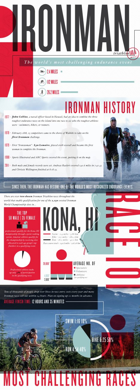
Not only does it feature colour blocks and tints, but photos also provide a structure for the information hierarchy. There are areas of the design which use white space itself as an enclosure device.
Enclosures help the reader to navigate the content more easily as it appears less daunting to digest.
In information design the use of enclosures hooks and maintains the reader throughout, and is something I use within every single piece of visual content I produce.
Summary for enclosure
- Start with a wireframe to explore which information needs separating, grouping and prioritising
- Use simple boxes or outlines to begin with, and look for more creative shapes and elements to add to the piece as the design progresses
- Incorporate other visual elements, such as photos, typography, illustration and even white or negative space
______________________________________________________________________________________
2 – Connection
Connections are essential for navigation, be it geographical, journalistic or experiential. We provide the user a way to denote a relationship between design elements by using simple points of contact.
The London Tube Map has to be one of the most iconic examples of how connection clearly aids user navigation. Instinctively readers understand which stations are linked by which routes, where journey changes can be made and therefore map their route efficiently and effectively. (Note the use of enclosures in the background to denote zones.)

A good ‘non-textbook’ example is this data visualisation by the super-talented team at Information is Beautiful.
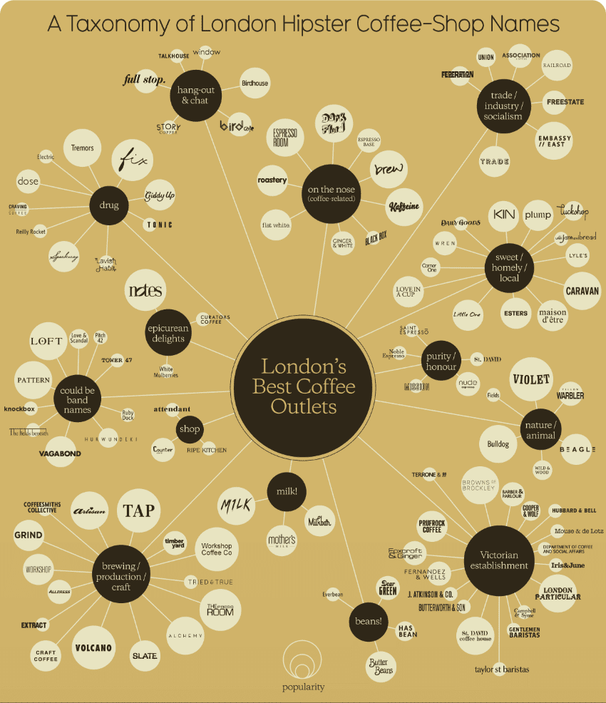
It cleverly maps out some of the best-loved coffee outlets in London by their unique selling proposition (USP); passion for fair-trade, atmosphere and ethos, or something altogether more abstract.
By grouping and using visual connections the designer has created a clear navigation system for readers to find their way through the information and narrow their choice of destination.
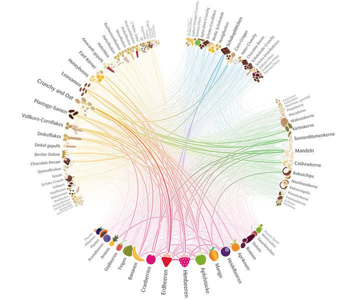
A less practical but more visually challenging example of connection within information design is the Müsli Ingredient Network created by Moritz Stefaner for mymuesli.com. The lines show connections between muesli contents, providing inspiration for customers who order bespoke muesli products.
Summary for Connection
- Connections between elements denote a relationship and can be used to show geographical routes, data patterns or groupings.
- Lines and other visual links can subtly help readers navigate information and can be less intrusive that enclosures within a design.
______________________________________________________________________________________
3 – Proximity
Although useful for all strands of design, proximity is essential and expected today by consumers within user experience mapping and layout. By grouping similar functionality / products / content in one area, the user can navigate to their desired area of information quickly and easily.
The Amazon homepage is a good resource for user experience best practice – after all, they have the resources and budget to support the research into achieving maximum engagement and conversion from their homepage.
Summary for Proximity
Items are instantly recognisable as connected due to their proximity to one another, allowing the user:
- to quickly scan the page,
- assimilate what type of information they are looking at, and
- locate it quickly … all essential for good user interface and information design.
______________________________________________________________________________________
These scientific rules for effective information design become second nature with practice, and are priceless to solving the puzzle of good information design. We use them each and every day within our projects.